Past Work
In-Play Sports — Frontend Redesign & UX Overhaul
Led a frontend redesign of key areas of the In-Play Sports platform — modernising core components, shipping a new notification system and changelog, and rebuilding the video list page to elevate analyst UX toward Hudl-tier standards.
Overview
In-Play Sports is analyst-facing SaaS: the product quality was improving, but parts of the UI still read like an older generation of tools. This engagement focused on key surfaces where analysts spend their time — making workflows faster, clearer, and closer to the polish users expect from top-tier sports video products.
What Shipped
- -Rebuilt core UI components into a cleaner, more consistent system
- -A new notification system with clearer hierarchy and less noise
- -A changelog experience that improved transparency and engagement
- -A full redesign of the video list page — navigation, density, and filtering
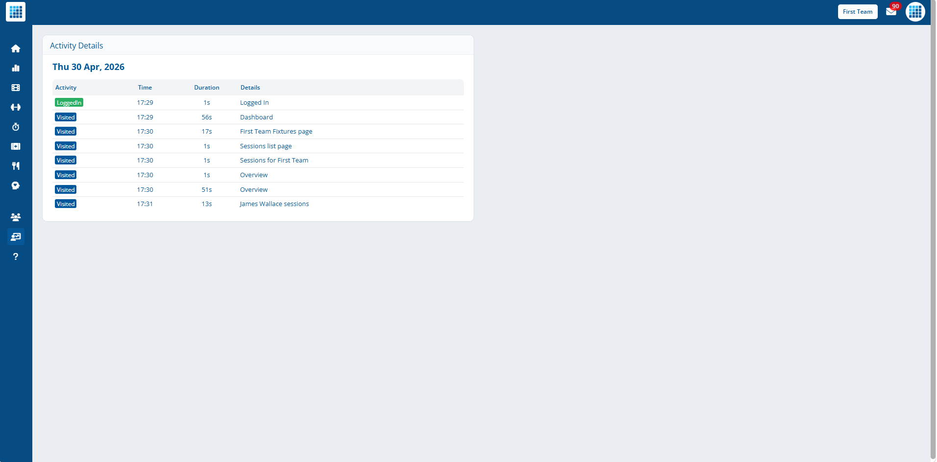
Notification System — Before / After
The original notifications were dense and hard to scan during live work. The redesign introduces clearer hierarchy, distinct states, and far less visual noise.
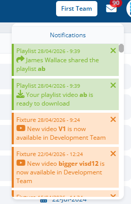
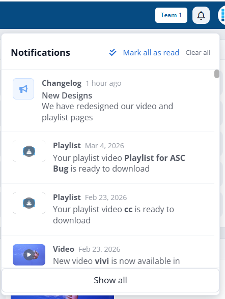
Notifications — pre and post redesign
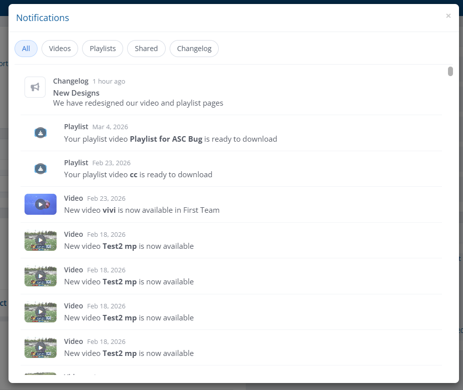
Grouping, read/unread states, and follow-up interactions
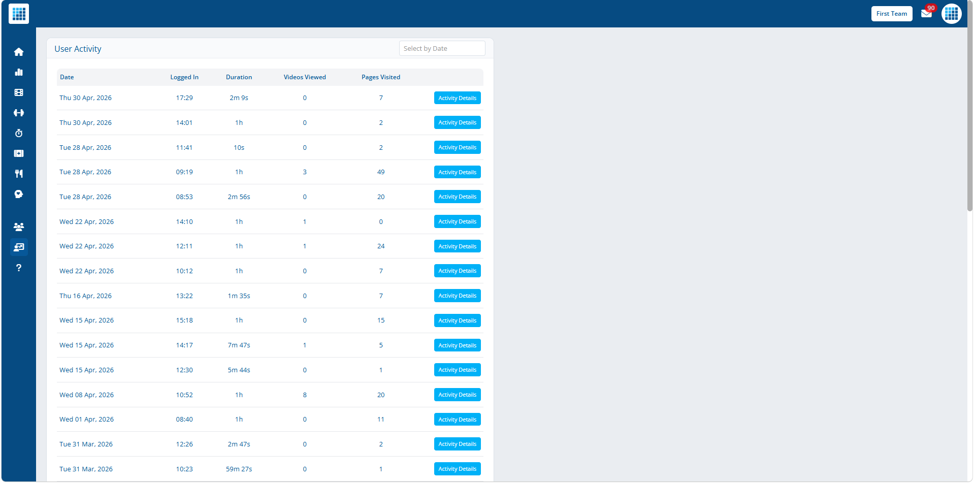
Video List Page — Before / After
Analysts spend a lot of time on the video list. The redesign rebuilt density, navigation, and filtering so scanning, filtering, and opening the right asset became a fast, repeat-friendly action.
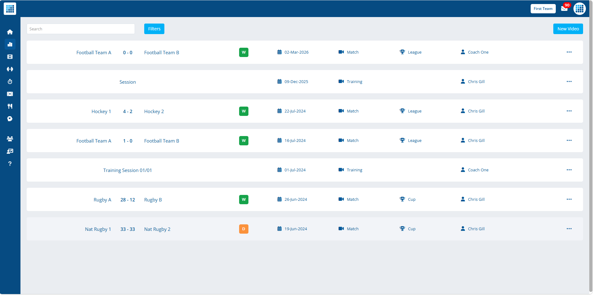
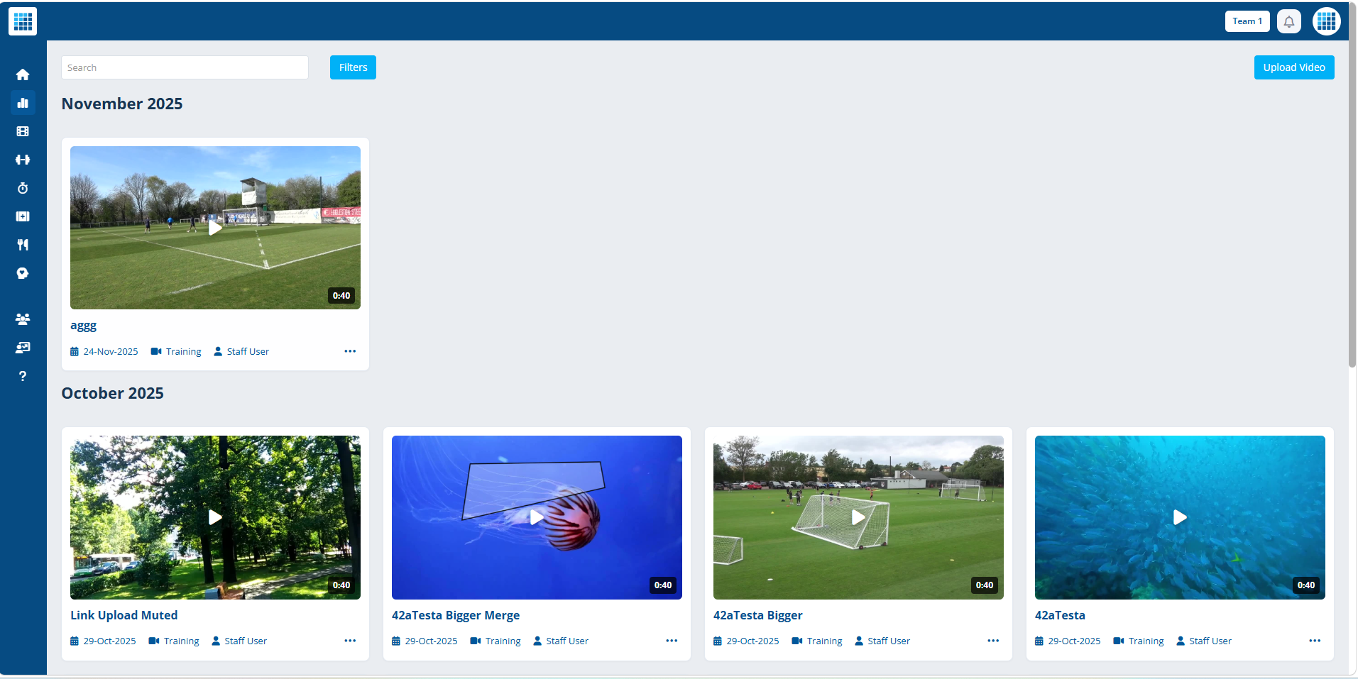
Video list page — before and after the redesign
Analytics Surfaces
Selected views from the modernised analytics surfaces — chart styling, data density, comparison layouts, and contextual UI built to feel at home next to higher-tier sports video products.
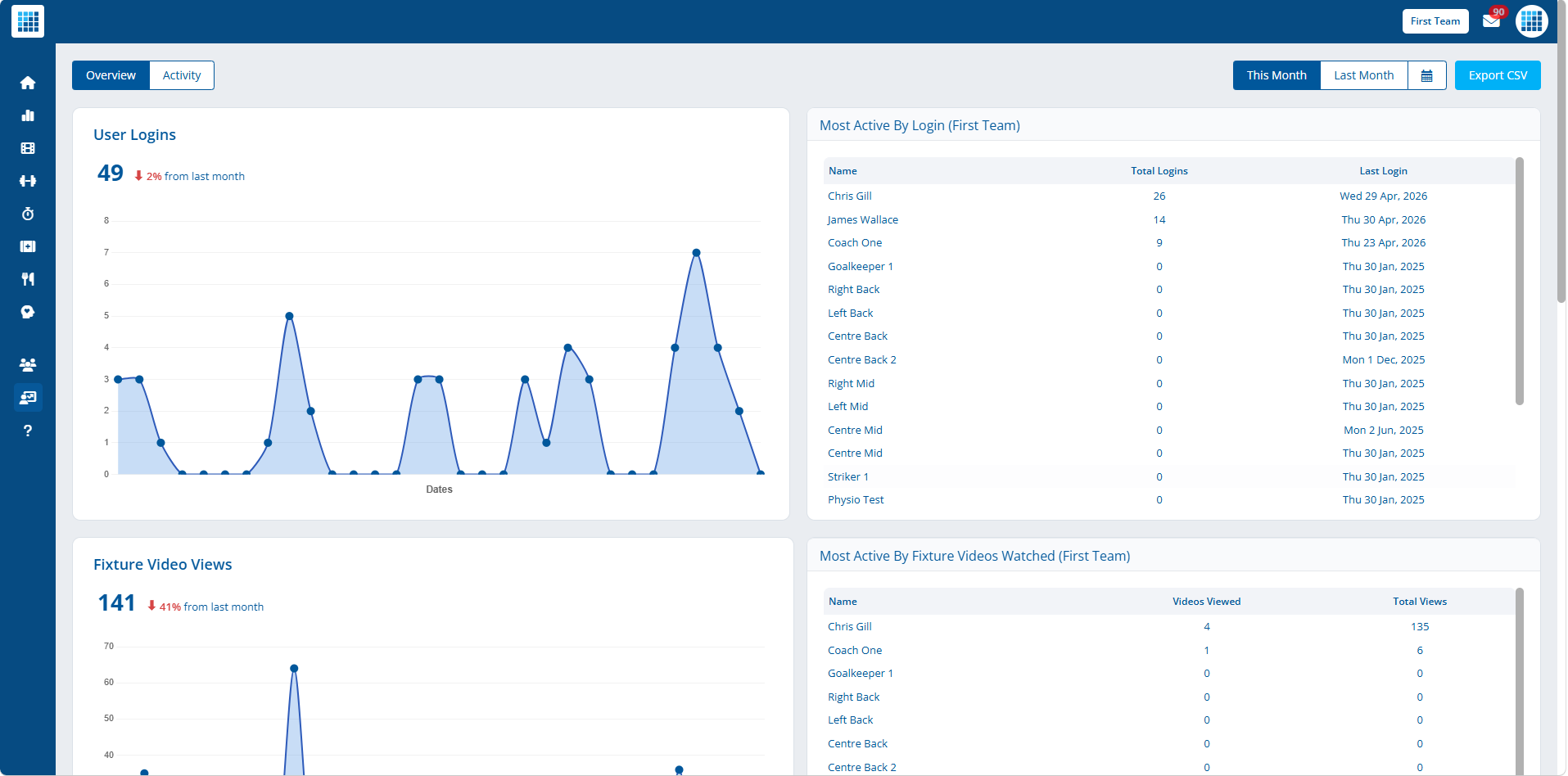
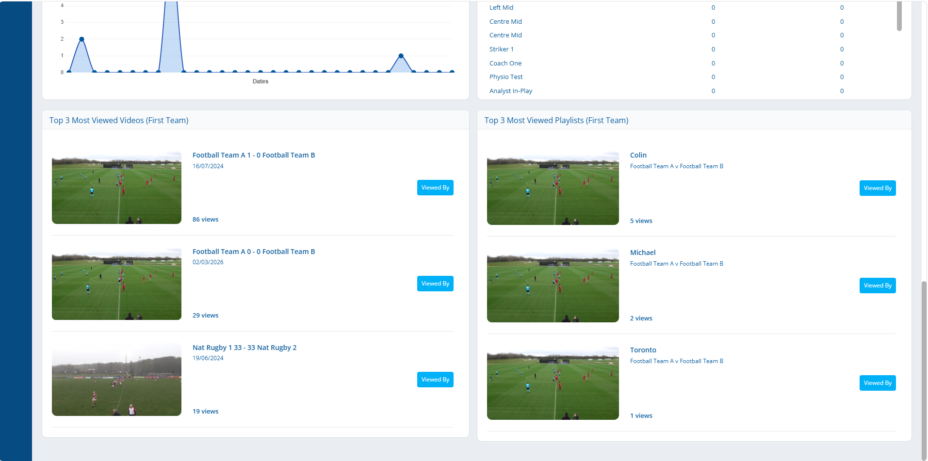
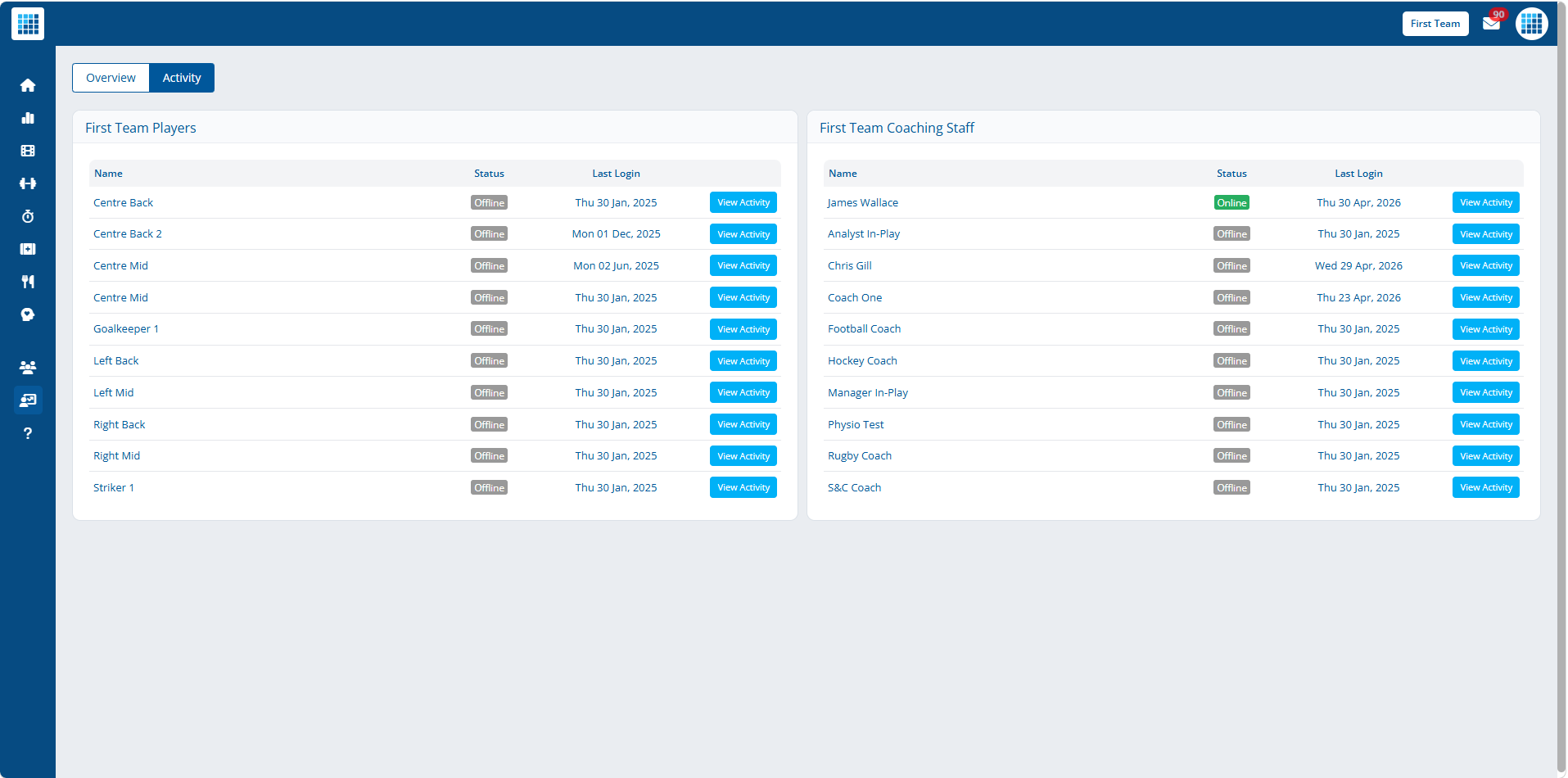
Selected analytics views from the redesign
Product Goal
The target was not just "new paint" — it was analyst UX that could sit next to higher-tier competitors without feeling like a downgrade. That meant tightening information architecture, reducing friction in repeat workflows, and making critical actions obvious.
Why It Mattered
For a platform selling to serious teams, the frontend is part of the proof. Modernising these areas reduced the gap between product capability and first-session experience.
Internal Links
Related Pages
In-Play Sports
Broader case study covering platform performance, security, and rebuild work.
servicePerformance Optimization
Front-to-back rescue and modernisation work on production SaaS platforms.
contactNeed a Frontend Reset?
Best fit when product UX is dragging behind the engineering underneath it.
High-Stakes Projects
Need this kind of delivery confidence on your project?
The strongest fit is work where reliability, scale, or technical risk matters enough that proof and judgment carry more weight than a generic dev retainer.